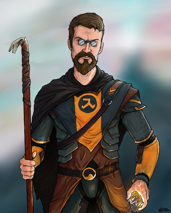
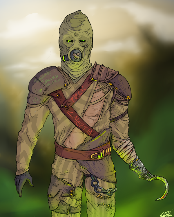
Page 3 of 5

Re: Russian Style

PostPosted: Thu Jul 09, 2015 4:12 pm
by ggtfim2
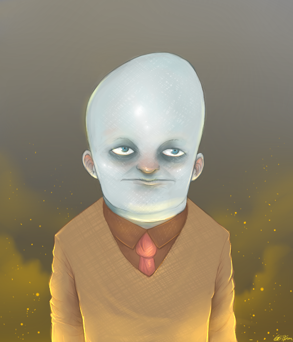
how you will not look like in a apocaliptic environment:
Image

Re: Russian Style

PostPosted: Mon Jul 13, 2015 6:30 am
by Waters
All this stuff looks really neat and I dig it alot, but something REALLY fucking bugs me.

Like just something from a pure fundamental level is missing, sometimes it feels like things are leaning, or they are constructed poorly, or the lines are boring, or something.

Great ambition though keep posting.

Re: Russian Style

PostPosted: Mon Jul 13, 2015 12:48 pm
by ggtfim2
Waters wrote:All this stuff looks really neat and I dig it alot, but something REALLY fucking bugs me.

Like just something from a pure fundamental level is missing, sometimes it feels like things are leaning, or they are constructed poorly, or the lines are boring, or something.

Great ambition though keep posting.


lol dude hahahah
i think i know that feeling..I usualy don't make ''plans'' for the poses,composition,...they are very simple (just things in the middle of the screen..sometimes not..)
thats something i really need to improve :d

Re: Nutcher

PostPosted: Fri Jul 17, 2015 11:18 am
by ggtfim2
Image

Re: Nutcher

PostPosted: Fri Jul 17, 2015 1:00 pm
by Raymond
I like this one, he gives off a really eerie vibe. The shading style you used on the blade of his hatchet looks really cool with the glare of the moon. And speaking of the moon, it would look really cool if you added a moon near the top corner of the image where all that blank space is. It looks cool without a moon, but it would add more light to the picture. It looks like you drew the light source coming from the left side of the picture since that side of him and his hatchet are illuminated, so even adding a moon in the top left corner of the image would look natural. Just a suggestion though.

Re: Nutcher

PostPosted: Fri Jul 17, 2015 1:21 pm
by ggtfim2
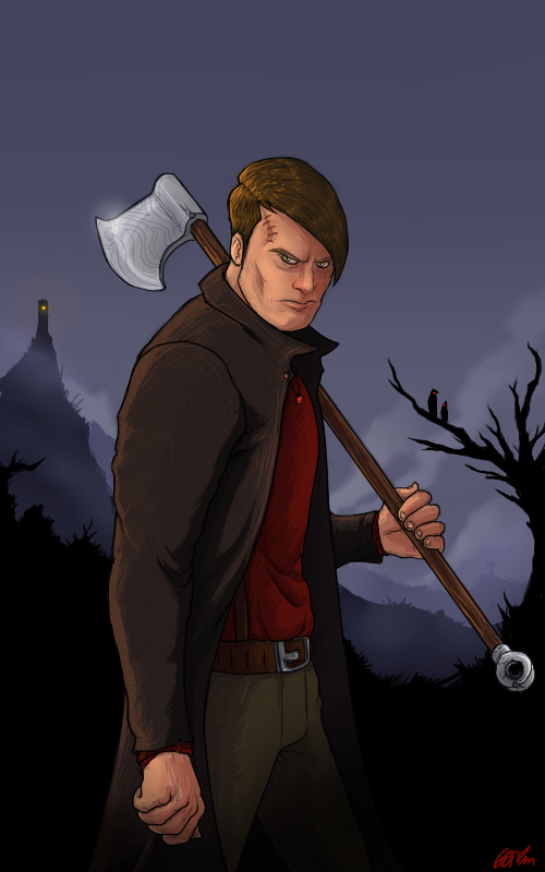
Raymond wrote:I like this one, he gives off a really eerie vibe. The shading style you used on the blade of his hatchet looks really cool with the glare of the moon. And speaking of the moon, it would look really cool if you added a moon near the top corner of the image where all that blank space is. It looks cool without a moon, but it would add more light to the picture. It looks like you drew the light source coming from the left side of the picture since that side of him and his hatchet are illuminated, so even adding a moon in the top left corner of the image would look natural. Just a suggestion though.


would be a cool thing on the painting,yes,but the moon is in front of him,that's why the shine on the axe
but i dont really thinkg about the moon xD
the light on him should be more to the blue/soft blue
looks like another source of light

Re: Nutcher

PostPosted: Sat Jul 18, 2015 11:50 am
by MCToast
The desperate Johhny Depp is my favorite

Re: Nutcher

PostPosted: Sat Jul 18, 2015 3:46 pm
by ggtfim2
MCToast wrote:The desperate Johhny Depp is my favorite

AFSDIJOHSAIUODLJDSIFUHJKSLDJ
holy shit
yeah,he looks like Johny Depp
but also looks like Kristen Stewart`s default face with beard

Re: Nutcher

PostPosted: Sun Jul 19, 2015 9:35 am
by Caleb
Just like Waters I like your stuff, but something bothers me just slightly. I tried to point it out, but it's kind of hard to see. Hopefully I managed to point the things out and it helps you a bit.

I think you draw heads slightly too big and arms slightly too short. Basically just work on your proportions. Also your color work is really straight forward, I think you could have much better atmosphere if you follow color patterns like explained in this tutorial by Sycra:
phpBB [video]

It's quite long, but a lot of it is just explaining further in-depth. The first 10 minutes or so do most the explaining.

Hope that helps!

Re: Nutcher

PostPosted: Sun Jul 19, 2015 10:28 am
by ggtfim2
i know this guy!

anatomy is the main thing i need to improve xdd
this is something that i am really unstable...sometimes the anatomy works;sometimes not

Re: HL2 CONFIRMED

PostPosted: Tue Jul 28, 2015 12:20 am
by ggtfim2
Image
dr.house

Re: bubblehead

PostPosted: Sun Aug 02, 2015 4:34 pm
by ggtfim2
Image

Re: bubblehead

PostPosted: Sun Aug 02, 2015 5:08 pm
by Lukas
i really like your art buddy, i love the STU series and the scars one
kudos for your work, i am really impressed

Re: bubblehead

PostPosted: Sun Aug 02, 2015 5:30 pm
by Josh
I like your newest quite a lot better than your previous works. I think this is because you did not use solid black outlines and instead blended them with the character and the background. Stops things from looking too sharp. Keep it up man (thumbsup

Re: bubblehead

PostPosted: Sun Aug 02, 2015 6:00 pm
by ggtfim2
<3 thanks for the coments,guys
-
yeah,i tried to do something more different..i've used colored lineart lewl