Feel free to use this, or post your own banner ideas.
![]() by FKA Motion » Tue Nov 11, 2014 7:01 pm
by FKA Motion » Tue Nov 11, 2014 7:01 pm

![]() by Daniël » Tue Nov 11, 2014 8:14 pm
by Daniël » Tue Nov 11, 2014 8:14 pm

![]() by Spock » Tue Nov 11, 2014 8:21 pm
by Spock » Tue Nov 11, 2014 8:21 pm

![]() by FKA Motion » Tue Nov 11, 2014 8:26 pm
by FKA Motion » Tue Nov 11, 2014 8:26 pm
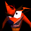
Daniël wrote:I'm a bit disappointed in the lack of a red nose, but I very much approve of this too.
It's kind of funny how I still don't really relate the new demon with our website, I'll probably always have the old one in my head.
![]() by Raymond » Tue Nov 11, 2014 8:56 pm
by Raymond » Tue Nov 11, 2014 8:56 pm
Spock wrote:Ooh, yes that should definitely be integrated in the Christmas banner. After the addition of a red nose.

![]() by Spock » Tue Nov 11, 2014 9:36 pm
by Spock » Tue Nov 11, 2014 9:36 pm
![]() by Daniël » Wed Nov 12, 2014 3:13 am
by Daniël » Wed Nov 12, 2014 3:13 am
![]() by FKA Motion » Wed Nov 12, 2014 3:38 am
by FKA Motion » Wed Nov 12, 2014 3:38 am
![]() by Alca » Wed Nov 12, 2014 5:00 am
by Alca » Wed Nov 12, 2014 5:00 am


![]() by SIFTER » Wed Nov 12, 2014 6:13 am
by SIFTER » Wed Nov 12, 2014 6:13 am

![]() by Caleb » Wed Nov 12, 2014 7:10 am
by Caleb » Wed Nov 12, 2014 7:10 am

![]() by Tiger » Wed Nov 12, 2014 7:26 am
by Tiger » Wed Nov 12, 2014 7:26 am

![]() by Mat » Wed Nov 12, 2014 7:33 am
by Mat » Wed Nov 12, 2014 7:33 am
Sifter wrote:Hm, it lacks something..
I think that adding a highlight would make the nose look more like a ball than a mouth.


![]() by Tiger » Wed Nov 12, 2014 7:53 am
by Tiger » Wed Nov 12, 2014 7:53 am
Mat wrote:Sifter wrote:Hm, it lacks something..
I think that adding a highlight would make the nose look more like a ball than a mouth.
The logo is basic so the highlight looks way too out of place. It was better flat.
Santa hat would be nice.
Users browsing this forum: No registered users and 36 guests

Style we_clearblue created by weeb.
Modded by TheDarkDemon.com | Logo design by Elliott Bear
Powered by phpBB © 2000, 2002, 2005, 2007 phpBB Group.