


Recent
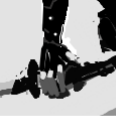
Drawing of a friend.

note: This is a friend of mine. He is 18 years old and already was on the mans physique in germany. A good guy.
this is his facebook site.
Older stuff. Lost all these files because my notebook broke. luckily uploaded them on deviantart.
Sketchy girl
Note: its my actual first drawing in photoshop. I really did take a lot of time to start drawing because I have still no idea how that program actually works. I guess it will take some time until I am able to use the layers properly and draw with more detail and color.
a girl
Note: I think I fucked up her left shoulder.
Riven
Notes: I fucked up the coloring so much.
Some tatooed guy
some random charakter idea


